
 Homular Interior them design their new home they pretty much gave carte blanche very fortunate in that they trusted expertise and paste and I understood their preferences. they all had a very clear vision of what they wanted if they wanted a family home. that would be your manned comfortable and really conducive to raising their young children but they also wanted to be sophisticate and that is because entertain quite. A bit and both their friends and extended family and also clients the family room is where the four of them spend most of their time together it was very important to have a lot of very comfortable seating in here. so chose this custom l-shaped sectional that really a Maximize is heating in here also added a couple of chairs and a pair of stools.
So they can really accommodate quite a few can in here probably one of the most favorite features of this room is the gallery wall inside the building of black and white photograph you wanted to be sure that it's meaningful to them. so chose photograph that would remind them of their many travels as well as their interests their passions in the dining room. actually use the table and chairs that the homeowners already had and wanted to keep we paired that dining room table with a beautiful vintage Persian rug. A lot of fun with wall of plate we picked a number of designs from different collections and was really a lot of fun putting it together into this little installation the signal is a more formal space little ones don't venture here very often. so we had a little more flexibility in the choice of furnishings and fabrics you will see quite a few plush fabric sentient velvet silk velvet quite a few glamorous details and finishes. A beautiful glass chandelier brass coffee tables actually chose two brass tables that put together for a larger piece. So that it creates a more intimate conversation area in the master bedroom our jumping-off point was a beautiful Persian rug that melody and steps already owned. now they actually the color paint also was a perfect space to incorporate that color into the palette also included some more masculine colors you find a lot of deep grain fabrics and here's follow these dramatic silk grapes. that ground the space a little more and again add a little bit more panache in the son's room melody really wanted a subtle to the theme of African safari while is really intervene. so we thought refund to marry the two and so you'll find a very fun Air Force penned in which they can play we have a plane suspended from the ceiling which is really delightful and the daughter's bedroom we already had the bunk bed. so those are jumping off point and from there added in more Silver's some gold some soft pinks as well some hot pinks. it's a room that can really grow with her it's been a little while since finish this project and I was so happy to see what we returned that melody have not really changed the thing.
0 Comments
 Homular Interior worked with them for years has been working on decorating their main floor second floor and this was the last space in their home to complete so brought in to finish a home office for her. which was perfect timing and was beginning to work from home. so she wanted a dedicated workspace she has a large family room in the basement so the nice thing is that we had space to still have the tv and the sofa area and a separate library and office area for to work from the bones of the space were beautiful. it has 10 foot ceilings it has a big window you'd never know that you're in a basement but the problem was that it was just very bland it had a beige carpet it had the builder beige walls i saw a lot of potential in it because it was so big it had natural light. but unfortunately it had just become a dumping ground.
so we really needed to find ways to create zones originally the room was very tone on tone so the walls were a neutral beige the floor was a lovely carpet but it was just very plain. so what needed to do particularly because white and light furniture we needed to create more contrast. so that it would feel interesting and grounded so a beautiful floor from torley's it's waterproof which is wonderful for a basement it's heated underneath. which makes it super comfortable and it's very durable and then we actually took the existing carpet that was in perfectly brand new condition and just had it bound to a custom area rug size and that way it makes this family room much more comfortable and it was a total save. a large sectional sofa that's comfortable for watching movies and just lounging around and that's the more casual everyday part of this space. but the area that utilizing every day for work is a large desk surface and a meeting table. we fell in love with this stone table from cocoon. it's got this really interesting detail on the edge and we thought it would be great for not only hosting meetings or using as another work surface. but also as a games table when the family gets together and then she has her large desk area. which is actually a dining table that we utilized as a desk because this was such a big room that it needed something that was large in scale. but still light enough that it didn't feel like an old world library table allen preferred not to have any cords around the desk. So instead of doing a traditional desk lamp we did this beautiful pendant light from union lighting and it's a great way to not only add a lot of illumination to the desk surface. but it also creates a little bit more of a feature in the space was really hoping for some beautiful built-ins and we looked at a few ideas some were traditional some were modern and landed on this cubby idea. where they float because it was a good way to display not only their large collection of books. but also they had a number of really interesting objects from travels and so it was a great way to put those on display too we did the quintessential library ladder in a contrasting black. it stands out this way and it really makes it feel much more old world while still being very functional for her one of the things i find. when i work with clients who have either a large collection or just a number of smaller objects that they'd to include in a space it's better if you can try and work them in some way into the architecture of the room. so the ledges and the bookshelves really help to give these smaller objects a sense of cohesion and purpose in the space so glad that and alan are enjoying the space this forgotten room has now become a space that they're able to use every day they love working down here which is wonderful to hear and they also have a space that they can enjoy with their family you.  Homular Interior most memorable tile from going into many modular kitchen and shooting bathrooms there are a few that really stand out for and to share those with you number one let's start with Natalie Chong now which we toured and the backsplash was very impressive. now it was all about the details in this case so basically she used goose she used a groove Carrara marble in a diamond shape also known as an equilateral know and placed. it in that tumbling cube pattern which already it's very nice but what made it Sparkle is that she went out of her way to source gold grout. it was just that little hint of glimmer that made it look super expensive and really special she loved it so much she used in her own kitchen number two still talking about grout used to work at house and home magazine. with us and when she redid her kids bathroom she didn't want to spend too much money on tile so she sourced a pink mosaic that was in the clearance section and what she did to add the wow factor is she got pink route she actually got her to match the pink to the pink of the tile. so just that pink on pink made it over the top super fun for two little girls and to this day all I can remember is how fantastic and unicorn like this bathroom was I love it.
now still in house this is a little moment where Sally really splurged it was a tie she was obsessing over from Popham design blonde Pam design not sure how you say that this tile is made in Morocco and the shipping was outrageous but well worth it in an all-white bathroom. it really took center stage and the best part is its opposites the mirrors. so pretty much from every angle of that bathroom you get a glimpse of this spectacular tile it's a concrete Moroccan tile with an outrageous pattern but she picked a really classic color for a bathroom a nice bright blue and she's still. so in love with it was a very good design choice very Instagram designer teen for a carriage Lane designs. it's that sort of merging of tile and wood and a very organic way but I have to say despite seeing it online a gazillion times. it was so spectacular in person to see how beautifully the heck style kind of flowed into the wood floor was breathtaking although it's a bit more difficult for her contractor to put together and then your average straight threshold it was well worth it because it was a very long sight line of tile meaning floor I think it was super successful in this case and it's a great way to make two simple materials textiles wood floor meets and become a work of art. now the last one is I guess controversial because bringing in subway tile and people hate it some people love it people are still using it because it is a classic. now the person who did it best in mind is stylist a food stylist. so of course her modular kitchen is tricked out and when designed it she designed a showstopper and to make the humble subway tile really stand out she went floor-to-ceiling and what I think is fun here is that she did it herself and that's what's great about subway tile. it's easy to stack it's easy to cut it's a simple tile and it won't date she went with let's call it Gray's for the grout. so as she put it it already looked dirty so she wouldn't have to worry about it genius right now want a really small grout line. which those little grout spacers couldn't give her. so what she did with her partner is they spaced it out with toothpicks to the photo I mean come on attention to detail right and it is to this day one of most favorite kitchens that it Natalie so there you go those are my favorite most memorable tile moments if there is a list or compilation that you think I should do just let me know in the comments below. 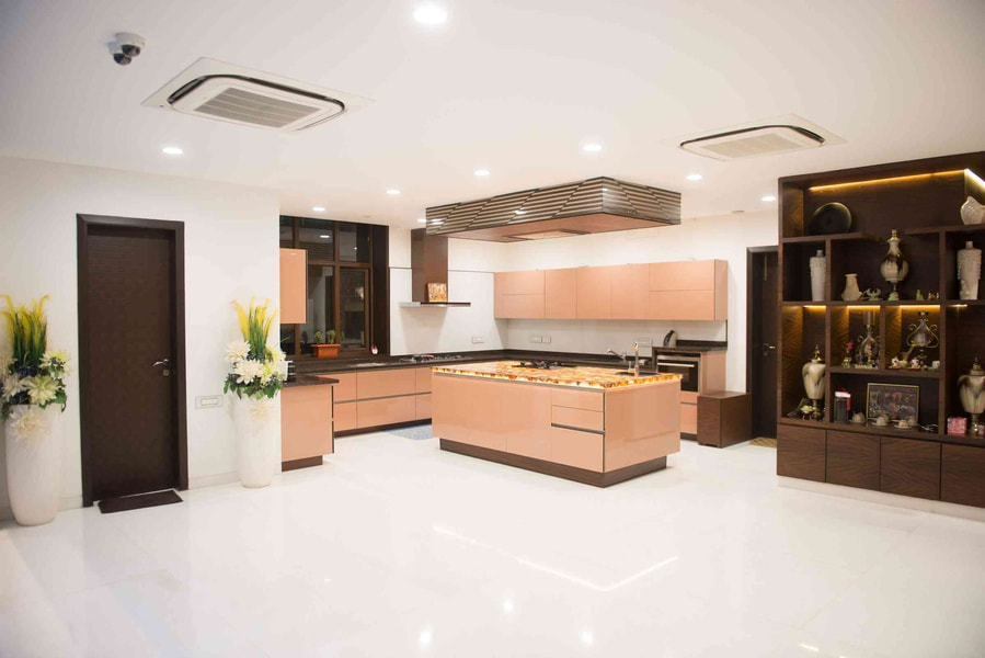 Throughout this beautiful home in the beach that was actually built in 2015 so it's quite an old one but we help them develop this home from being potential investment property to a home that they really wanted to live in and invest in the homeowners. are and they are actually kind of tough for clients since is a contractor in home developments. we wanted to make sure that we were really adding value considering they were well versed in renovating homes. when we first saw the place I've had a lot of character which is great because we knew that the homeowners really loved that it was similar in terms of layout. however it was a lot more closed off so they did open up some of the walls and create larger entryways they did maintain simple transition between the rooms but there was still a bit of a divide dana is actually grown up and lived in the beaches her whole life. so she is well akin to what the design aesthetic for the beaches is and she did have affinity for that however. she is a little bit more of a modern woman and did want to have a little bit more of an urban edge in modernity applied to the coastal aesthetic that's typically seen here in the beach the entrance of the home was a lot smaller than you see. now it had a small little vestibule which did create a bit of a smaller passageway to their upstairs.
so they removed that to open up the space and they then added a topper to their rad to kind of create more of a console. so it's a landing space more so than a transitional space they did have a fireplace which was their original brick color and no storage on either side of it. so we added some shelving units there which Galen was able to do one of the most important points to the clients was to bring some of the textiles that they had especially from into the space. we really wanted to ensure that we were honoring that without it looking too cluttered because. they definitely don't want to live in a cluttered space. so it was really great to use the textiles that they had some of the wooden decor elements that they brought back from their travels and really showcased them in a more elegant. way they were really invested in rights and neutrals but they weren't afraid of adding color. so we knew wanted to do we're Greeks we felt that was in the vein of the beaches as well as the coastal feel. it's actually a great but it does obviously have a lot of green and blue undertones to it there are family of four they to have a movie night. they wanted it to be functional for that purpose not have to go to the basement I knew that they really the sectional and they were just not wanting to commit to. it didn't feel it was elevated enough but we were all for it we wanted them to be happy with the space. we wanted to Muse it and with every other piece that we added we wanted to make sure that it would enhance the sectional versus making it seem frumpy I think that there is a bit of a myth around sectionals do. we need raising the network the garbage truck the first entryway that they opened up really sparked the idea to then open up the secondary entryway to the room and that was a high impact decision that they made. the dining room was a dining room however. It didn't have the bar stools that are on their island and that was a real functional space for them having kids in the morning have their breakfast up there. so that was a really great addition the way that we concealed the radiator and added bar fridge as well as some wine storage on either side really turned that once useless piece of space into a real functional almost bar area. we were considering you know maintaining what that was in the home originally which was a white marble however we felt this was an opportunity to really have a bit more of an edge and decided to go. with a black honed marble so the modular kitchen was already there and it was a great jumping-off point for the other colors of the home that. we chose we really the fact that they chose a shaker style. which is typically more traditional but add a little bit more modern elements with the brass poles as well as a fun detailed backsplash the nook was created yet it didn't have the additional layers to make it comfortable. we added some throw pillows a great shoot toughing and window textiles and we also added an art TV which was typically not a choice installing a television into an eating area however. it was super functional for their children in an area that they can use more often than not the master bedroom was an area focus for us they really focused on the main living areas of the home. which a lot of homeowners and families do so it was really nice to spend time and see what really worked for them and what they wanted to create is their little slice of peace in their home. so we kept him really neutral but we did play with textures upstairs as well we created a really nice serene space with an upholstered headboard again they are well-traveled and they appreciate different textiles. so we've added a little bit more of a beachy vibe without going to themed we wanted to add a little vintage and a little bit more modernity. so we have these great task lamps on either side of the bed and then we have this great vintage chest the client is super savvy and found an amazing chest on Marketplace on and we were. so excited because it was really going to be the piece that was going to complete the space their little girl Rowan is a beautiful little girl. we wanted to add a little bit of playfulness without going too young because she did want to grow with the space we found a fabric that was great for the window treatments as well as her vanity seat that was colorful playful without reading too juvenile and this allowed the space to really be adorable without being too cutesy a fun point actually in Rowan's room is that the vanity was from the original homeowner. so we ended up painting it out white to bring it up a notch and then out of the really pretty textiles on top at the beginning to be honest as if it nervous working. with them they were so well-versed and renovating homes already I was hoping that we would bring enough value that they would be happy with the end result however they ended up being such great minds because they were super quick to decide they were really quick on making decisions and they also trusted which is such a big part of a client relationship. so in the end super thankful and they turned out to be wonderful.  Homular interior renovation was for four the couple has two little boys and they were really looking for more space they another house that would give them everything they wanted and so they decided to renovate. versus move they already had an attic that was a little bit of a makeshift bedroom with a big walk out deck. so it really didn't function no one with little kids uses a third floor deck because they're always downstairs and so they brought us on to bump out. the entire third floor of the house to make a beautiful master suite. when you walk down the hall of this third floor addition the first thing you see are those spectacular doors. they were just an idea from the very beginning they are the piezo resistance the pocket doors are workbench here in Delhi the doors are painted a beautiful blue they have a curved detail.
so it's an arch it feels a little bit reminiscent of a church door or something more traditional and then you open these beautiful doors to a very soft and soothing master bedroom the bedroom is so lovely it worked out even better. than i could have imagined there's a light soft blue grass cloth which really steals the show grass cloth is a really nice touch too because it has a little bit of sound absorption it has texture to it you don't need to add a lot of art to the walls. when you have a beautiful grass cloth the white oak floors are a lovely canvas to the layering that goes on top. so there's the custom rug that we had made it's a really great designer trick you can take a broad loom this one was from studio 321b here in delhi and they measured the space for us had it cut to the size that we needed and then bound in that contrasting black tape. what is that it's a lot more affordable than finding an area rug and it fits the space perfectly the four poster bed is very modern but that's what helps keep the space from feeling too traditional this bed is so unbelievably solid it's a metal frame. it was made here locally and it just elevates the eye right up to the top. it's really quite stunning i had this vision of a four poster but i knew that the ceilings were really only eight feet tall. so in order to have that four poster feeling without it dominating i decided to paint the black on the bottom and then paint the white on the top. So by having the white on the top it feels a little bit lighter and a little less oppressive and it works in the space the bathroom that we designed is one of parts of the renault it's really bright and airy it felt really dark when we were mid renault. so we decided to add a skylight and it was the best part of the bathroom. it adds tons of natural light you don't even need the lights on in the middle of the day the vanity is a really great example of sustainability in design. so we are trying to be a little bit more mindful by using locally sourced wood to build the vanity it has less of a carbon footprint and it's also beautiful and extremely durable the shower is amazing i'm super jealous one of those in house it's a walk-in curbless shower we added the valve so when you turn on the shower you don't have to get wet because in these old delhi houses as you know sometimes it takes a while for the water to heat up so that's kind of a nice bonus feature there's of course in-floor heating throughout the bathroom and there's little tucked away storage in the corner beneath the dormer the floor tile is another part of the bathroom that it's from creekside tile. it is a beautiful mosaic what's nice is it has anti-slip properties because there's a lot of grout it's a great choice to put in a shower for young and old that way you don't have to worry about slipping when you have wet feet it also fits perfectly with the cohesive design of the third floor the white and the black they're classic but they have a little bit of a modern edge in their shape we did this little work nook for our clients when they have to work late or work from home and i wanted to give it a little bit of personality. it was important to me that this work desk space not be in their main bedroom the layout just lent itself to having it just outside the doors which was a bonus and then we added really pretty wallpaper just to get a little bit of personality and it's soothing it's soft it's a little bit feminine but how the feminine wallpaper contrasts with the more modern and masculine desk because this is a relatively small Delhi home it's only about 18 feet wide it's a semi-detached it could potentially feel really closed in and tight for space. so our goal with doing space planning on this floor was to make it feel bigger than it is and i really think we achieved that i think we got really lucky with the length of the house we managed to fit in all of the things that we needed. so we got the bathroom we got a walk-in master closet and an office nook as well as a really nice size bedroom to fit a king-size bed also by doing the white oak floors keeping the paint relatively neutral and doing really big broad windows at the back to let in all the light it makes it feel so much bigger than it really is you.  Homular interior bought it because to sink In teeth into renovating a property in sort of an up and coming area. so i renovated everything but the modular kitchen and probably real estate experts would say don't do that but i knew it was a contained space it was in the middle of an open concept. main floor it had a very large kitchen island in the middle that gave a lot of storage. i didn't want to have a solid modular kitchen island anymore actually wanted something that you could see passing through to the sun room. because it was sort of blocking that view so i had to maximize storage out of that small space best that i could part of the kitchen renovation was actually opening up the doorway or entryway into the sun room it was already open but it wasn't open enough and i wanted to bring in the light and let people see more of the prettiness of the sunroom. when they were standing in the kitchen so when i designed the kitchen i wanted to maximize storage and i used all the vertical space i could because it's the victorian and the ceilings are high but then there were some other smart solutions used to do that as well. so one of things to do in the modular kitchen are two in one drawers on either side of the stove you end up layering up the amount of storage that you get out of any drawer and it keeps you super organized.
so it's one of tricks and even in this tiny little space managed to squeeze in a little five slot wine rack critical really really was quite happy about that managed to solve all my storage needs in the galley kitchen itself and it allowed to do a kitchen island that no longer needed to serve that purpose it was just going to be a pretty piece of furniture that could be placed in the middle of the kitchen that i could perch up to and have a glass of wine with a friend or put groceries down on to unload into the fridge and it's a really lovely piece. it's one of pieces in the room i just the wood and it's just another element brought into the kitchen to warm. it up but the style the overall style of the kitchen was biggest challenges. to sort of really discipline to take a step back and what does this house need and a white kitchen just made sense at the same time i didn't want an all-white kitchen for brass and white i always have been i know brass is a trend we don't know about staying or not but if you something go for it so that really went far to warm up the kitchen. The white that i chose as well for the kitchen is an off-white it's a very warm color by benjamin moore called snowfall white and i also decided to bring in lots of beat up bold art pieces and coveting this piece for at least two years and i couldn't be happier wake up every morning and quite thrilled to look at our frida on the wall she's colorful and fun and filled with whimsy the one thing it’s really quite pleased about in this kitchen is for a bar area in between two very tall vertical cabinets where i put a beautiful vase and there's a mirror there so it bounces the light around the room over the kitchen island table it's on a pulley system. which i just love because when trying to get a little bit of atmosphere in the room and you have a glass of wine with a friend you can pull the light down and it creates a little bit more intimacy around that table but you know if you want to pull it out of the way you can just pull it up and it offers task lighting there's also a neat little area that is open and there really to serve the function of having the door swing that goes down into the basement and to do something with that area. so i decided to create a little bit of a vignette there with woven baskets that got from snub and then put a little stool below because to actually climb up to get things sometimes it's a very vertical kitchen you know for the haters of white kitchens it's all in what you do with it you know i mean there's a reason why art galleries are white what you put into the kitchen can play a huge role in changing. the feeling of the space honestly think all those things turn it from being a white kitchen to a kitchen with character though the favorite thing of all about this kitchen is the fact that made it for is a fantastic worker is not a kitchen company not even set up to make kitchens but i approached him and after a lot of convincing agreed to do it for but he built it and it and honestly i think it's one of the most beautiful kitchens ever built.  Homular interior renovations and to be honest they are often transformed into modern white boxes now in this series i want to show you an example of an outstanding space. that has been transformed and turned into a functional elegant home perfect for a family look at this terrace. now for downtown toronto this is a gem now when the bespoke group bought the unit it had never been touched and never been renovated. it had the curly brick pavers and just a whole bunch of planters but they saw an opportunity to add some privacy hide. some of the brick add some design elements and it all began with the stone pavers this was a huge facelift for the space modernized it cleaned it up and then they wanted to tackle the brick. now because this is a Homular there are a lot of rules one of those rules is to not attach anything to the existing brick but they had a great idea.
Their solution was to add these metal screens which have a really cool chevron design element to them and they just sit on the ground on some concrete blocks. so they're not going anywhere no wind no hurricane's going to take them away and now they have this super cool backdrop and really ties in the whole modern aesthetic on their terrace to make this an entertainer's dream the bespoke group. added an outdoor kitchen rules state that you should not have any permanent modifications to your terrace. so this outdoor modular kitchen was designed with that rule in mind it comes in various parts all of these structures separate even the countertop has a seam. So it can just be popped off and taken away and speaking of countertops they even thought to add the backsplash so your fruit doesn't go tumbling to the back of the barbecue is that for porchetta corn on the cob rotating chicken wings come on now just like indoors this terrace was designed with zones there's a nice cozy covered area. where you can have cocktails there is a dining room where you can have dinner parties and then a lounging area. where you can enjoy some sun this terrace was the perfect complement to an incredible makeover. now if you have an older unit just think about the potential just mind your bulkheads you.  Homular Interior Home and it is an incredible opportunity to raise funds and awareness for all the important work that they do as one of the top five cancer centers in the world. it has been a wonderful collaboration this year to work alongside green park group to create this stunning home. all in support of the princess margaret cancer foundation we have a stunning entryway. when you first walk in and when you look both right and left it's this mirror image of a beautiful living room and also your formal dining room to keep all of those formal entertaining areas at the front of the house in the more public areas and then the more family focused at the back of the home for a little bit more privacy and just relaxation.
we have a large mud room that's at the back of the house it's perfectly adjacent to one of the garages and one of the things in a home is a well-functioning mudroom and in this home in particular the space was there to be able to put an additional washer and dryer in this space to have two entries and i think now. that spending a lot of time living in our home these areas that are communal are very important to a family the modular kitchen obviously everyone says is the heart of the home and in this home in particular. it's at the center of the main floor so it truly is the epicenter for the day in and day out living of a family i wanted it really to have a relaxed feel and to reflect the home. as a whole i decided to bring in the light oak flooring into the beams in the ceiling i created multiple tones between the white but also the gray and the black undertones and it feels very inviting as it looks out into this three season you can relax here with your family children can sit and do homework i think in all honesty it has created the heartbeat for the rest of the home the pantry this year was an interesting space and i think it was a space that i wanted to have a little bit of fun with i put an additional full-size fridge. with freezer in there i did a great spot with a great menu to create smoothies fresh juices to do some of your baking with your family and tucked away inside. which you may not know is a separate small little door and this door leads to a doggie room because so many families over this last year have adopted and brought new members into their family. so i wanted to utilize this space in some way that i think people could really relate to after this past year the family room is one of the spaces in this home. That i actually began with i started the design process here and i wanted to bring that sort of natural relaxed vibe to this space again bringing in a lot of natural wood warm elements the cast stone mantle the beams that are on the ceiling that reflect the hardwood flooring and the comfortable sitting areas. Because having a spot that feels warm and inviting as the sunlight just pours into the space was really important to and i think keeping it clean and crisp yet inviting is what succeeded at the in-law suite this year was something that i wanted to run with it is one of the first times. That we have had a main floor space as large as this it could be used as a principal bedroom and it was really important to create a space that was accessible. so when you walk into this space we have created the suite with full accessibility so we've widened all the doorways we've created a five foot turning radius a wheel in shower and reinforced all the walls for grab rails in the future. so whether or not the home is used that way now or perhaps as we look at more generational family living i think created a stunning space that still will work for any family depending on the time and lifestyle that they have so although the in-law suite is here on the main floor there are a ton of bedrooms still to have a look at in their upstairs on the second floor you.  So that was a disaster I have painted kitchen cabinets before I once painted kitchen cabinets but it's a lot of very small delhi kitchen. so I think it had six cabinets so I did have some experience which I kind of knew a little bit of what I was getting into which is why I needed you is a style director at house and home magazine she brought in to help her makeover her small kitchen in her rental apartment and have some stories for you positive and negative. have learning experiences to share with you so that if you decide to do this for yourself you can learn from our mistakes of which made quite a few. so step one is to empty your cupboards step two is to label. which cabinet door goes where you will thank later you labeled them label them. which ones went where but had a couple good days in the forecast yeah. so we set up a paint studio in the backyard which I blissfully have this was be our great chance to spray them and give a real pro finish. so we do loss because that's a good technique
if you don't want to sand everything and they were solid would set it all up to spray set up the sprayer good times ahead and ran into some difficulty their first rater wasn't meant to be used horizontally right. so as soon as you do this it changes the not get technical about it just didn't work it didn't it's work controller came in handy there and had the cabinet set up on triangles. so the only reason could flip it right away without letting them dry completely is because they were just sitting on these tiny little points. they save you a ton of time went ahead as paint and primer in one so I was really excited snow need to prep. with primer maybe should have I think the paint and primer in one would work beautifully. on a painted cabinet but this was solid wood and it just soaked it up you put on one coat it would dry and you come back and sink. where'd the paint go yes so five coats later five cups later did the lowers with the primer you having it posted end up using of paint y. so in the end solid wood by a start with the primer in the meantime I was back here painting boxes so basically a project that we kind of cheekily thought would take us two days ended up taking us seven in total with the drying time. you just being safe for the paint of really cure so that when it sits up against another painted surface like the painted boxes it doesn't stick and pull off and get tacky. so we brought them back here put the hardware back on and we hadn't labeled the hinges didn't realize this but of course the cabinets I've been calibrated that they closed evenly and flat wait there's an here no and so then we had to re calibrate all of the hardware. which was a little frustrating and by like we had to re calibrate actually the to calibrate this ended up being a three-person so like one person could leave and deal with their frustrations that come back here the Internet's all doing before you know half a day half a day of three people really working. It looks awesome it does and we're forever bonded we're still friends I don't know if I'd be standing if I did it by myself actually I'd still be painting really happy that you picked green on the bottom they worked really well with the floor with your and so pretty. so pretty and then the white on top kept it light because it is just one room the room doesn't get a ton of natural light. so the white cabinets really enhance the natural light in here which is wonderful and because the kitchen is part of the living room is a small space painting the lowers in a green color also gave it a little bit more of a furniture feel and then the white cabinets recedes I should also mention that these have cabinet fronts but you took them off to also create an area look what you did a while ago I did it as soon as I missed him. so would we do it again given that it ended up taking us a whole week I would say that perfect because look at your kitchen now totally worth it could hire someone to actually paint and put all the cabinet fronts back I would a to do it mine that said I'm also about to paint a dresser so I don't know if I even I've learned own lessons whatever you do just get it done right and a lot of your kitchens.  Homular Interior were looking at doing about a six to eight foot extension on the home in order to open it up and give them more space once they ran the numbers it proved to be cost prohibitive. they were looking obviously like everybody else in the city to sort of get more usable family-friendly space. we determined that by removing just a couple of walls that lightly but really that was a huge undertaking and you know took up a big chunk of the budget to the structural and the engineering component. they called me in after they decided that actually because they needed assistance with the renovation and planning out the space from start to finish.the front hall was can we say lacking in character it was a little boring and that's offending anybody the mill work in the front hall was per-existing just to elevate. it a little bit and make it a little bit warmer and cheaper i had it wallpapered this is a mission wallpaper from new wall. so when you say mission you think but this is actually a vinyl paper so very good for families. it's much better to clean and to take care of than even regular paint or drywall and it didn't break the bank doesn't it feel like a cozy hug like a chic little missoni like throw or sweater. the kids are very creative they're into music and art and the front room is always like a playroom catch-all room for the kids for the girls so we decided with my clients that that front room would be dedicated. as a cool little sitting spot for the two girls and they would have their guitar and piano there as well set up that room is just. So cute and cozy and it's just a little space for their kids to be able to get creative the vibe of this home is sort of more i would say transitional modern. we added a fireplace those really cool sconces they're brass with alabaster which is pretty cool because it's great how those two lights have a different patina and finish on them that sofa is like a spaceship. it's so good one of the other big criteria for clients was to have a big luxurious comfy sofa and in a space that's not too wide. we wanted it to be a little bit lower to the ground it still allows for that sight line from the front room back into the modular kitchen and it doesn't feel overwhelming like the army. so you can easily sit on them exactly dual purpose and you can use them as like a side table for your drinks or for whatever yeah your skittles i got a whole bowl of skittles in the front you. i know i ate like a whole handful yesterday was crazy. so the modular kitchen white kitchens do people like them do people not like them i mean in this case clients love white kitchens one of the cool things that. We did was to freshen it up and modernize it is give them a blue island the island is hale navy the color blue and yellow happy colors i would say but a hundred percent always wanted a white modular kitchen. one of the other elements was obviously getting in as much storage space as we possibly could squeeze. It into the space so we included a cute little banquette that could function as a secondary dining space a homework space for the kids and it's maximized for storage there is pull out storage underneath for all of the kids. you know paper and pens and crafts and scissors and whatever look see i wasn't lying kids stuff the appliance garage slash the coffee station. if space allows for that have an kitchen appliance garage or a space where you can store all those things that would naturally live on a counter and clutter up a space and then that way. when you know your guests come over when you at the end of the day when you're sort of done you're posting or cleanup you close those doors shut and you don't have 600 different appliances out on your counter and then opposite of me is a little catch-all entry station where you come in put your mail down and then there's also additional storage you know for broom and cleaning supplies and what have you so we literally considered every single lifestyle element or component you know my client's everyday routine when planning out this modular kitchen. i think that's important to consider too not just i want a beautiful island and beautiful appliances it's the not so like sexy but everyday stuff you don't want your crap all over the place after you've spent. so much time and money renovating your home consider the boring things like where do i put my broom where do i put my vacuum where do i put my you know paper towels those are all the practical things that you need to think of particularly when you're designing a kitchen you. |
Author
Rakesh rout Archives
August 2023
Home improvement
|
 RSS Feed
